Saturday, September 22, 2007

Kid Hunter by Bounty Hunter


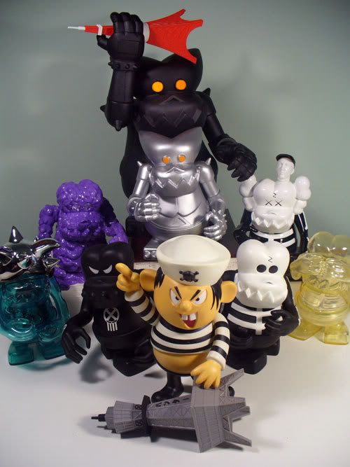
Now we take it to where it all began. The whole designer toy craze that we all know and love now was started with this figure: Kid Hunter by Bounty Hunter!

Bounty Hunter started in 1995 in the Harajuku district of Tokyo as a store with a punk sensibility selling various things from clothing to older toys that owner Hikaru Iwanaga would pick up on frequent trips to the United States (Spawn toys, Star Wars, old cereal mascots...). Iwanaga says that the name Bounty Hunter pays homage to the Star Wars character Boba Fett and also that the name comes from the actual hunting of these things (the bounty).

In the upcoming Toypunks documentary (www.toypunks.com), Iwanaga talks about discovering toys and punk rock music when he was growing up, comparing the two as similar experiences. Be it a talking GI Joe or the Sex Pistols, it all blew him away. He was very interested in the punk rock music and lifestyle as well as the American commercial culture such as cereal mascots.

As the shop expanded, they began to make their own shirts and toys. Friends would help the cause, and eventually in 1997 a character from a tshirt was made into what would be the first designer vinyl. Now famous A Bathing Ape designer Skatething developed the Kid Hunter character... sort of a punk rock kid version of Captain Crunch... and an excellent combination of Iwanaga's passions. He wanted to make a toy that was round like Snoopy as opposed to the harsh lines of McFarlane's Spawn toys that were so popular in the late 90s.

"One only has to see how the character is the embodiment of the Bounty Hunter aesthetic; a combination of a nod to the vinyl figures of American cereal characters and the kitschiness that represents, with the unsettling evil imagery and air of dissent that the punk cultivates. When Kid Hunter was released in 1997 the designer vinyl scene had begun."

Fuck Art. Let's Punk.

Thanks also to:
All Other Toys Suck
This is the article that pushed me over the BxH ledge!

Header //N/A//:
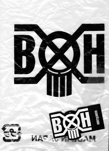
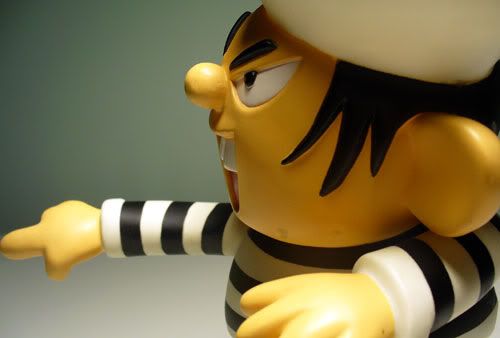
As far as I know, Bounty Hunter toys do not come in designed packaging of any kind. Every one I have seen comes in a clear plastic bag with a big BXH logo and a sticker stapled to the top.


Sculpt //4.5 out of 5//:
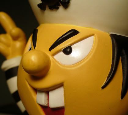
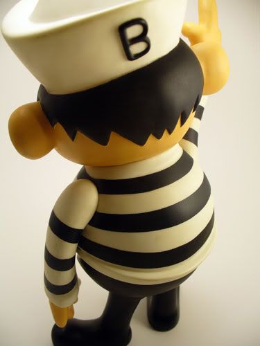
I probably can't say much about this figure that has not been said before. Knowing the intent behind this design, I would have to say they nailed it. This toy is the punk rock of toys... when the popular toys of the time were highly detailed sculpts, this toy went against the grain completely and brought something more simple, stripped down and different to the table. Realism is forgone here for a nicely stylized, pissed off little pirate kid.

The balance on the figure is slightly off because of his giant head, but as long as both arms stay in their original position this is not such an issue. The undersized legs that are unable to be moved adds to the instability.

The seams are all well integrated in the design, with the seam underneath the striped shirt being very well placed. For such a simple figure, the poses that can be obtained are great.

Paint //4 out of 5//:
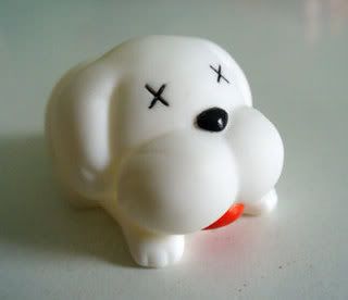
The paint on this figure is unlike many toys that I will talk about on this blog, but it is just what the figure needs. Clean lines and solid application... bold contrast just as the cartoony cereal mascots it is paying homage to would have been represented with. The mostly black and white approach would apparently guide the color scheme of many Bounty Hunter toys that would follow.

There are some small issues with detail work, particularly on the stringy hair hanging from under the hat, but nothing major. Overall a clean, appropriate paint job.


Coolness //5 out of 5//:
It's the first designer vinyl toy. It's application is well thought out and executed. It's a punk rock pirate with a pot belly.

If this figure were to come out today, I don't know that my feelings about this piece would be what they are, but the fact that it is a little piece of vinyl history really adds to it for me.

It is just a cool toy with a really cool history.

Value //3 out of 5//:
I have no idea how many of these are around now, or how much it cost initially, but now it is pricey on the secondhand market. I would rate it lower on value except for the history and the fact that it is a decade old. I could see the prices of these increasing with the release of the toypunks film in November.

Overall //5 out of 5//:
Positives: An original, attitude, awesome belly

Negatives: Expensive now and will only become moreso, top-heavy

If you are a fan of the current wave of vinyl toys out there, this piece could be a part of your collection and make sense with all of it. Bounty Hunter helped to start the toy lives of Frank Kozik, James Jarvis, and KAWS, and Kid Hunter was the toy that paved the way. Highly recommended.


Friday, September 21, 2007

Bitten by the BxH bug

Over the past couple months, I have built up what I feel is a well-rounded little Bounty Hunter collection. I sold off quite a bit of stuff (pretty much the rest of my Western collection save a few pieces) to fund it, and I am very glad I did now that I have everything in hand.

When I first got into Japanese vinyl, I have to admit I didn't get into these. Granted, I didn't give them much of a look as I was into solely the monsters and blobs and horrors that are new and vintage kaiju, but at a time when my tastes had moved from Western to Eastern style toys, these Bounty Hunter toys that really seem like a fusion of both styles did not speak to me.
After the initial dust settled and the kaiju buying spree slowed, I found my collection moving toward more cohesive little cells... aided by the separated shelved in the Detolf.
I had the vinyl wrestlers anchored by some sweet vintage Tiger Mask figures.
I had the strange beasts that I craved initially... now moving toward more smaller run, hands on style figures like Anaraku's Goga and the Bemon Pollution beast... as opposed to lots and lots of Hedorahs.
And I had the humanoid figures: two legs, two arms, no tail... Ultraman style. Strange monsters in suits and the monochrome Dada felt like a pretty unique facet of my collection.
As I tweaked these shelves and wrote about them in my blog here, I learned more of the history of these toys, the inspirations and the directions they had taken. That's when I came across the Kid Hunter. Here was a fusion of a campy cereal mascot and a pissed off punk rock kid.
And here is where it started for me. I really looked into Bounty Hunter at this point and had a new appreciation for the cleaner looks, the attitude, and the background.
So here is a photo of the new family. It is a great part of my collection now. It isn't everything that is out there by BxH, but it's a good sampling I feel and I am pretty proud of where it has gone.
I plan to do some reviews/blogs about all these figures in time, but for now enjoy the madness!


Sunday, September 16, 2007

Vinyl Morality

Last night I unexpectedly found myself questioning this incredible new hobby of mine. Never did I think that something like collecting toys could actually be very damaging.

It started with a conversation on skullbrain.org about Kidrobot and their quality control issues lately. It was argued that quality checks can be difficult due to the factories that make them being in remote locations in China where no one speaks english and the workers are essentially unskilled laborers. I raised the question why there are no factories opened in North America to solve problems such as this. The answer was (besides the obvious cheaper foreign labor issue) that the materials used in production, including both the vinyl and the paints/dyes violate laws set by the Environmental Protection Agency.

So now my concern had moved completely from the quality conversation to "Is my hobby here promoting the destruction of some environment?"

I was told that the softer grades of vinyl used in making these toys we all love contain high levels of PCB's.

PCB's (Polychlorinated biphenyls) are classified as persistent organic pollutants and were banned in the 1970s in the United States.

These pollutants are (from wikipedia) "organic compounds that are resistant to environmental degradation through chemical, biological, and photolytic processes. Because of this, they have been observed to persist in the environment, to be capable of long-range transport, bioaccumulate in human and animal tissue, biomagnify in food chains, and to have potential significant impacts on human health and the environment."

PCB
persistent organic pollutants

These materials are highly toxic in their initial states, and the technology used to produce them is basically obsolete. Apparently Japan is much more polluted than I ever thought. Vinyl is vinyl and no very suitable alternative exists outside hard plastics which would totally change what these toys are. The vinyl has very long molecules which leads to instability, and the molecules constantly are gassed into the air essentially... which is toxic. There are also solvents used in the production to make the vinyl smooth which is also damaging to the environment.

Even the completed vinyl toys let off a gas that could be toxic! That fantastic smell is poison!

Learning all of this has left me at sort of a crossroads. I want to learn more. But can I continue with this hobby with the knowledge that I am adding to this pollution?

Recently i have stopped watching pro wrestling for somewhat related reason.

I have been a pro wrestling fan for over 20 years (through good and bad believe me) but this latest steroid business in the WWE has me turning it off completely. I even wrote a letter to WWE to explain this to them.

I understand it is up to each individual performer in the industry what he does with his body, but I no longer want to support these large companies (WWE, TNA) that evidently do not have a proper wellness program in place to prevent all the drug use. They are perpetuating the horrible lifestyle that is leaving so many of these guys dead before they are 50. I feel guilty providing ratings/revenue for a company that doesnt care about its employees enough.

Just as I now feel a levelof guilt for patronizing an industry that could be damaging.

I am not a militant environmentalist or anything close to it, but I do feel responsibility for things like this, and try to do things to play what little part I can. I take my own reusable shopping bags at the grocery store, I recycle, I buy organic foods. But I drive a normal old gas car... I wear leather... all of that fun stuff.

I have not come to a conclusion about all of this. I want to learn more obviously, and it is hard to dump something that I have really grown to love in a very short amount of time.


I want to thank Frank Kozik for most of this information, as I have plundered many of his words to talk about my own issues with this. Thank you, Frank.

Friday, September 7, 2007

Flickr

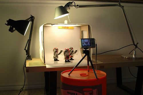
Most of my photos here are linked to Photobucket, but the organization there leaves something to be desired. I have this Flickr account that was not really getting used all that much, so I am keeping an album on there of my dirty little habit you so faithfully read about.


Tuesday, September 4, 2007

Chicken Fever Ultimo by Sinbad Toys

¡Viva la raza! El Pollo Fiebre (Chicken Fever) Ultimo is a collaboration between Sinbad Toys, Rong Zi and Kaiju-Taro. It was released along with another Chicken Fever (Uno Dos Tres Version) in late April this year.


At first I didn't know what to think of Chicken Fever. I was very new to the Eastern vinyl collecting world (I still am in so many ways), and I had never seen this figure before. There were teaser banners on kaiju-taro for what appeared to be a lucha libre themed toy coming out. I was very excited to see what was happening, but when I saw that it was a mutant chicken, well, color me unimpressed.

I was coming into this with little or no knowledge of Japanese fight figures or of the existing Chicken Fever sculpt. Here I was all excited that I may be able to get in on an exclusive monster toy from kaiju-taro and it would be a luchador!


And it was a chicken all along.


I was wanting Godzilla type beasts or melting skeletons or something like that.

Well, fast forward a few months in my kaiju collecting life, and I now have an established little vinyl toy wrestling collection. I went a little nuts on vintage Tiger Mask figures... some Gargamel fight figures... Kozik's colorways of El Panda and Tequila... even a Kinnikuman themed Secret Base Skullbrain thrown in there for good measure. As I am trying to round out this wrestling shelf in the Detolf with a little variety, the Chicken Fever Ultimo comes up for sale on the skullbrain board. This time I had a different perspective on the genre and decided to pick it up!


I'm going to try a new category here: Header. Not all figures I have came with headers... and some come with not only headers but included artwork as was seen with the Eriagun from last week. So I want to talk about if a header is BLAH or if it truly needs to be shown off. I may go back and add this to my previous reviews also... sort of like the packaging for my Kinnikuman Romandoh toys. I am a graphic designer after all!

I will try to head all my new posts with the headers of the toys! FUN!!

Header //3.5 out of 5//:
The artwork you see at the top of this article is very clean and colorful. I think the type choices go well with the toy, and the graphical lucha masks are a cool touch.
The cool little lucha mask icon is a nice as it combines elements of a traditional lucha mask with Chicken Fever's mutated beak.

While I prefer header art that has a more personal touch, this is approaching a more polished, professional look and is not so bad. I think it works.


Sculpt //3 out of 5//:
The Chicken Fever sculpt is original and not so original at the same time. How many mutant chicken toys have you ever seen? Yea me either. But the general "fight stance" of this toy is something that has become pretty well established in the industry... particularly with Secret Base toys. The exaggerated arms ending in clinched fists (or boxing gloves as seen with many Secret Base figures) and the short stumpy legs are common in this genre.

The head is what sets the Chicken Fever apart from his ghostly cousins at Secret Base. The large cranium, little beady eyes, textured face, little pointy teeth, little horns and the dramatic crest on top of the head... these are all nice touches in making this figure stand out.


The fact that it is cast in bright yellow vinyl helps it to stand out as well, obviously.


I wish the figure was a bit better balanced. Because of the tiny legs and giant head, Mr. Pollo is a bit top heavy. Add in his long arms and cape/mask and you have a figure that has to be positioned just right lest he fall face first before his big match even starts. The arms have to stay down with the knuckles close to the surface to get the best balance. With the arms up or out, it just becomes very easy to tip over.

Paint //2.5 out of 5//:
While technically the paint on the figure is done well, there just isn't much of it. The gold highlights are the best part of the paint application... adding emphasis on his torso and the bridge of the nose, and balancing the color out by putting the same fold on the fingernails and toenails on the extremities.


The orange shorts, however, leave me wanting more. There is a singlet sculpted into this figure, but it just seems to be ignored. I think there could be some cool paint applications if this whole outfit was emphasized and not just the shorts. Also, I don't know if the orange color itself is the best, although I don't really have an idea of what a suitable alternative would be... maybe a red like the cape he is wearing would work a little better.


I like the detail work on the little eyes and the tiny little teeth... very cool touches, but unfortunately these are covered up by the included mask.

Other than the gold highlights and the shorts, the figure does not have much in the way of paint. I'm not saying it should be slapped on in layers, but to me this minimal paint application leaves this figure feeling just a little plain.

Coolness //4.5 out of 5//:
Despite our rocky beginnings, the Chicken Fever and I have formed a very stable relationship. He is already going to score bonus points with me because he is a wrestler, but when you add in a real cloth mask and a CAPE.... now you're talking!


El Pollo Fiebre Ultimo comes with a spandex-like mask as well as a bright red cape. These are awesome additions that really make this little chicken one of a kind.

There are some issues with these, however.

The red rings around the eye area of the mask seem to just be ironed on when they should be attached much more firmly. It is not easy to get the mask on and off, and all the tugging makes the already peeling-off eye holes want to come off even more.
The sides actually even came already unattached from the green fabric.

The velcro on the neck strap of the cape looks like it wants to come off as well... it is simply glued on instead of sewn.


The mask itself is very tight and with the horns and beak, very tough to get on and off the figure. I thought it was going to either tear the mask or break part of the figure both times. And after I had taken the mask off and put it back on, the elastic around the bottom had stretched a little out of shape like Larry David's sleeves in that one episode of Curb your Enthusiasm. This could have worked a little better I think if the mask opened in the back with velcro instead of being pulled off over the top of his big head and comb.


My solution... I'm leaving the mask on! This figure is meant for the mask in my opinion. I only took it off really to see the little guy's face for the first time and to give all my thousands of blog fans a peek at the mystery!


The fact that this guy is a luchador makes him great to me. I grew up with pro wrestling being a big part of my life, and in recent years I have become very interested in Mexican wrestling and the mystique and pageantry of masked wrestling in Mexico and other countries.

Value //3 out of 5//:
This figure was limited to 30 I believe, and was fairly inexpensive in comparison to other similar pieces. While still it is pricey for what essentially is a hollow vinyl toy, you can still find these on the after market for around retail price. Because of the theme I find it personally a better value.


Overall //4 out of 5//:
Positives: Unique; MASK!; CAPE!; cockfighting without the cruelty to animals!

Negatives: Plain figure outside the mask and cape; iffy balance; mask tough to take on and off; cape velcro and eye holes not well glued


Fans of lucha and Japanese fight figures looking for a quirky little monster to add to your collection, look no further. There are a few Chicken Fevers out there, but only Ultimo has a MASK and CAPE. I would recommend this figure to anyone in the market for such... but for someone just looking for a cool figure, this might not be for you. The fight figures are in a world by themselves from the larger Godzilla style kaiju toys!


Wednesday, August 29, 2007

Eriagun by Bwana Spoons and Gargamel

Bwana Spoons is an artist from Portland, Oregon. His paintings (which can be viewed at his own grasshut corp) have a style that is very recognizeable as his own. They are very organic and illustrative. I'm not sure when it happened, but Bwana moved into the world of toy production as well with figures like Steven the Bat and Edward the Gator I assume from his paintings, and then kaiju pieces produced with the help of Gargamel.


Bwana has what appears to be a fantastic working relationship with Gargamel as he has released a whole series of figures with his unique coloring style including this figure, the Papastroyer, the Killer whales, Bakobas, the pet of Papa and Eriagun, and all the minis that correspond.

I think there is a little story behind the series of Gargamel Hedoran colorways, which was a real drawing point for me. Each figure (except for the mini Pupstroyer) came with a print of an accompanying Bwana painting of the figure. The paintings themselves create characters out of these previously characterless toys. Not to say that these sculpts have no character... I mean that they lacked a story as far as I know.

It seems that Papatroyer and his son Earth Restroyer live in this nameless swamp/forest. They have a pet (Pupstroyer) that Earthy rides around like a big sloppy horse once Pup is big enough.


Papa is cool and laid back, smokes a big pipe and probably loves his son in his own way. He was a hippie as a youngster himself, and wants to teach his blobby little son a life of low stress and flowers. He might be more of a friend to Earthy than a father figure.

Little Earth Restroyer, who is a bit wilder; a little rock star living in the swamps; unfortunately needs more discipline. Papa's lax parenting and excessive herb smoking leave Earthy sometimes bored and desiring something more loud and crazy. When Earth gets older and his sports fill out, he goes nuts and changes his name to the very rock star Eriagun. The swamp just feels too small for him, and we finally find Eriagun running away from home, leaving his Papa and now grown p
et behind with a curse to the quiet life. Fuck you, dad. I'm going to rock in the real world...


Honestly, I was not all that into the Bwana style when I first started my weird little hobby months ago, but on the advice of fellow skullbrain board members, I had to have one to make a true judgement. I liked his paintings in 2D better than the organic application on a three-dimensional vinyl canvas. And honestly, I still don't really feel it after I have owned it for awhile. But I definitely felt much more appreciation for this particular piece after I had it in my hands and was able to look at it from all angles... to see the paint application... to look at it catch the light.

Header //4 out of 5//:
This is a cool header. While it is not complex, I like that it has a homemade feel to it... almost earthy like much of Bwana's work seems to be. The font used for the title is fitting, and the red is a nice contrast to the green figure contained underneath it. The background texture is pulled from elements of Bwana's swamp painting in the Eriagun print. Also, while I do like a header with a do-it-yourself feel, the quality of the paper and print used feels like an older inkjet printer.

Sculpt //4 out of 5//: 
This particular Gargamel sculpt is not exclusive to Gargamel, but rather is one of their "updated bootlegs" so to speak of an old IKB Hedorah-style toy from the 70s. In my opinion, the original sculpt of this was a waxy mess. Hukkodo has since reproduced it, and judging from the photos, I just don't think it looks good at all. You can see all the old sculpts in the photo to the right here.

The Gargamel sculpt(s) that came out a few years ago is a cleaner, more visually interesting form. It maintains the original feel and shape of the figure, while smoothing out the rough areas. This particular Hedoran form is the most human looking, and even has the added indication of claws on his hands and feet, a pretty cool feature not seen on smog themed monsters.

Bwana has chosen a mostly-transparent green vinyl for all his toys in this line, which really adds to the overall sculpt in my opinion. The light passing through and bouncing off the flowing, organic forms really adds to the figure.

Paint //3 out of 5//:
I am evidence that the approach used in the paint here is an acquired taste. I guess I never acquired enough, however. I have found in my short kaiju life that I prefer either a very fluid, murky approach... or very clean. Bwana's paint application to the Eriagun can be described as cheery and organic. Dots! Many of his Gargamel releases are adorned with the dots. While this is quite a unique approach to the medium, ultimately it still wasn't for me.

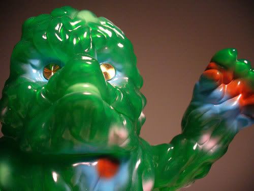
The application and execution of the style is fantastic, however. Bwana succeeds in taking a messy, pollution themed creature and making him a happier friend of the Earth! The colors aren't complimentary, but still work well together. The light blue on the cool green of the vinyl looks nice and is contrasted with the warm red down the belly and on the extremities.

I really like the cool blue around Gargamel's trademark metallic eyes.

The little tongue rules too


Coolness //4.25 out of 5//:
This is a standout piece, and there is no question where it came from once you know. Bwana has made this figure his own despite many other colorways of it existing, and he must be commended for this. While not my favorite of all time just due to my personal tastes, this figure is very nice. I am putting my personal bias aside and showing it for what it is: a unique approach to an established genre.

Value //2.5 out of 5//
It's going to cost you. While you do get a print and original header with and Eriagun, you can also get the same Gargamel sculpt for significantly less at this point.

Overall //2.5 out of 5//:
Positives: Unique, attractive, cool story, comes with a numbered print, has a cool tongue

Negatives: Pricey on the after market, seems to target a more specific audience, didn't fit in like I wanted with my collection

If you are feeling this paint job, then by all means I recommend this figure. It is fantastic if it is what you are looking for. I don't mean to shit on it in any way with my seemingly low overall grade, I just want to emphasize that I gave the figure a chance and still never felt like it was tops in my collection. I guess some things just aren't for me, and thus Eriagun has moved to a better home with a loving new pair of parents!


Sunday, August 26, 2007

Do-it-yourself light tent

A first for my new blog here... someone else's stuff!


Board member meczilla on skullbrain.org (Andy Chang) posted this cool little how-to showing a light tent for taking some cool, professional style photos of your toys. I will definitely be making one of these! I will post an update when I get mine set up.

Thanks, Andy!

Check out some of Andy's photos on his Flickr page


I've been looking into taking clean studio-style shots of my toys for a while and everything was pointing me towards a light tent setup. A Smith Victor two light kit runs about 100 bucks. When I added "DIY" to my Google search I found some very practical and extremely cheap ways to get the same effect.
I used:

-A compact 6.1 megapixel Nikon S1 point-and-shoot camera.

-Mini tripod (10 bucks) - You could use a stack of books or boxes too but you'll be restricted to 90 degree angle shots.

- A banker's box (Free) - Cut windows out of the sides and top. Cut all the way to the back of the box on top so you can affix a...

-Chip Clip (pack of two for a dollar)

-Backdrop (Free) - I used the back of a Borat mini poster. Colored posterboard would probably work well too.

-Paper towels (cheap) - Drape them over your box windows.

-Two desklamps (Free-$???) - You probably have some laying around. I used 60 watt flourescent bulbs for nice cool light.


Experiment with your camera's exposure settings, lighting angles, camera placement, and framing your composition. Toys are very patient and will put up with your artsy wankering. Be careful about those paper towels though, probably flammable if you are going for a marathon shoot.

Turn the flash off and use the self-timer feature to minimize shake from your hand pressing the shutter button. There should be a way to adjust the timer to something minimal. Check your manual. In my case it's 10 seconds.

Presto! Fresh out of the camera with no Photoshop.


I think these photos turned out great. Like I said, I will post my set up also when I get around to it. I would like to experiment with different color backdrops, lighting angles, and maybe thickness of the paper around the box to diffuse the light even more.

Tuesday, August 21, 2007

Gas Bawer by Longneck

Since I reviewed my new Bemon and drew the BIG BATTEL scene between the Bemon and his arch-nemesis the Gas Bawer (in my mind anyway), I decided to finally review the Bawer figure. I picked up this figure from Super7 a few months ago on a whim and it has remained a focal part of my rapidly changing collection.

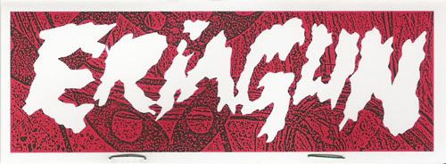
Like the Bemon, the Gas Bawer is shrouded in mystery for me, as I honestly know very little about him. With the Bemon at least I have some background though the old Smogun header. But as far as I know, the Gas Bawer's only background is that he is a relatively new character created from scratch. It has been speculated that the figure was designed by the same person that designed the Bemon figure, and evidently the Gas Bawer was sold in the same Japanese shop. I would like to verify this!

What draws me to him like the others is the pollution aspect. What makes the Gas Bawer unique is that where essentially all pollution themed kaiju are what appear to be mobile piles of sludge, he seems to be a mobile volcano spewing his noxious fumes over the land.

This was the only Longneck figure that I knew about until they released this:

I'm not positive what is name is, but the head on this snail creature is very phallic. I figured surely it coincidence until photos of the snail's undercarriage showed up!

No mistaking what that is supposed to be!

Anyway, back to mine, this new figure got me looking at the Gas Bawer again. As I was drawing the Bawer in my sketch posted earlier, I noticed how the arms had a phallic appearance as well. And the folds on the chest began to take on a whole new vaginal appearance! Could this be a common theme in Longneck figures? I guess we'll see when a new Longneck beast comes our way. Just thought this was kind of interesting.

There are several color schemes of the Bawer from a black, grimy looking one to an almost completely white albino. There is a pink one with spots that is supposed to resemble a strawberry, and one painted to resemble Mt. Fuji in Japan. I really like the color scheme of this one I have, although I just don't think it has the popularity of the Bemon.

I compare it so much to the Bemon mainly due to the two figures' similarities... general shape, the pollution theme, etc.

Sculpt (3.5 out of 5): This figure has a unique look for sure. Unlike the other pollution monsters around, the Gas Bawer is a walking mound of cracked stone, and this is reflected well in the sculpt. The cracked texture of the surface is nice... it reminds me of Marvel Comic's Thing from the Fantastic Four.

The giant smooth eye in the front becomes the obvious focal point in that is essentially the only smooth surface on the entire figure. There is also a giant, creepy vertical eye on his back that adds to the oddity of this monster as well.

Another nice touch in the sculpt is the "chest wrinkle" and what appear to be exhaust tubes around the waste. I can image the noxious fumes spraying from the chest and mid-section of the beast as his head explodes up top.They look almost rubbery or fleshy and add more contrast on the otherwise rocky surface.

The body is a little too barreled in my opinion. There is no distinction between the chest, waist and pelvis of the creature except for the skirt formed by the exhaust tubes. The legs seem a little too stumpy (it looks as though he would have trouble moving well) and the arms are posed at a bit of an awkward angle.

I would also have liked to see articulation at the hips and/or under the head instead of the big seam across the figure's belly. I suppose this was needed somehow in the sculpting process due to the shape of the head or something, but the seam under his chest is distracting and could have been hidden better I think. Granted, the legs couldn't really be posed, but it would have been really nice to be able to turn the head and have the seams hidden a little better.


Paint (3.75 out of 5)
: While there aren't as many colors as the Bemons (and no hand paints as far as I know), the Gas Bawers sport some great paint jobs... all very different from one another. This particular figure has an overall red scheme in the vinyl which is contrasted well with a cool blue and black sprayed on top. There is a metallic gold used for highlights as well in the large eye, on the tops of the claws and on the tips of the exhaust valves.

It is a pretty simple paint application despite all the colors involved. I cannot help compare to my Bemon which despite having only one paint applied, the mix of clean application to the eyes and messy runs that mesh well with the sludge surface. This Bawer figure has a uniform, airbrushed approach throughout which works for the rocky texture, but could be more interesting with a more fluid application I think. With the gaps left in the blue in the front, I believe a runny feel is what the intention is anyway, as if the red were running down the chest.

I do really like the colors used, and where they are used. The black top of the head really adds to the volcanic feel and the blue on the front helps to add variety and add a more organic feel to the hot rocks.... like there is some sludge mixed in with that volcanic, gassy ash.

Decent paint application, and good color selection, but could have a more interesting application.

Coolness (4 out of 5)
: To me this is still a very cool figure. I'm a sucker for uniquities, and even though this is another pollution monster in a large collection of them, this is the only rocky themed kaiju I own. What's not to love about a hideous volcano monster that spews gas and has a giant cyclops thing going on? Well, unless hideous just isn't for you I guess.

Value (3 out of 5): In the United States, these have a hefty pricetag. In comparison to similar toys, it's about par, however. Guess I'm just not a high roller. It is very large and comes in crazy colors, but it just does not have the same cool home made yet still professional feel that some other comparable toys do.

Overall (4 out of 5):
Positives: Unique approach to the pollution monster theme, nice colors, large in size

Negatives: Somewhat boring paint application, awkward joints, seam across belly

I would recommend this toy to any collector interested. In the battle of pollution beasts, I still view him as my favorite underdog (to Bemon). Secretly I want him to win in the battle that I drew earlier... well, that's not so secret anymore.

Monday, August 20, 2007

Bawer v Bemon!


I spent way too long on this. I draw like I read... ssssslllllllloooooowwwwwllllllyyyyyyyyyyy

Thursday, August 16, 2007

Bemon!

Well, you've seen a few of my drawings of him and he has starred in my fantastic Celga story, so I figure it's time to write about the figure itself.


I don't know a lot of the background of this guy, although from what I have read the figure is actually called KOUGAI KAIJU (something like Pollution Monster... how original) and that the company that maes him is called Bemon. I think Bemon is a bit easier, so until I find something else by the company, I will stick with it.
I have had to just piece together information from old message board posts, but I am trying to learn more.

This figure is known for its super low production numbers (often 30 or less figures per run) and super crazy paint schemes. Many of the first runs of these were handpainted. With the free flowing sculpt and hand applied paint (that evidently would often be clumpy and textured), the Bemon Pollution Monster has a great do-it-yourself feel and sort of a punk rock feel. 
You can see some photos below that I swiped from kaiju-taro.com that really shows the variety that comes with these pieces. Take into account that many are also hand painted, and you really find yourself with what are essentially one of a kind figures. I have seen a lot of photos of these, and I really haven't seen two that look exactly the same.. 

There are screen printed headers and inserts that come with these that really add to the DIY feel of this toy as well. Very cool if you are into that sort of thing. It's like the zines your buddies (or you) used to make on the library copier way back then. I stole the header photo above from kaiju-taro.com as well. It looks a little more impressive than the one that came with my Bemon.


The Bemon Pollution monster evidently was at least dreamed of by the company IKB back in the 70s. He appeared on the header of the original Smogun (see below), but was never made into a figure until recently by a completely different company. Since The original Smogun has been reproduced this year, let's hope an old school Bemon might come out looking a little different. Kogai Kaiju version 2.0??


Sculpt (4.5 out of 5): With the free style of this figure, I think rating the sculpt is very subjective. What I find appealing here, many people would not like at all. 

Technically, the sculpt is fine. Since there are no feet and just a wide, flat base the figure is well balanced and very stable. The arms and head are very well connected... don't feel loose at all.

Aesthetically I think the Bemon is fantastic. I started my kaiju obsession with Hedorah figures... the original pollution monster, and many companies have taken their artistic liberties with the Hedorah form. From there there were bootleg versions of this style of character... large slimy piles of goop all intent on polluting the world! I really like the almost expressionist style of these and the Bemon sculpts. There are chunks and bumps and it all flows together in a Jabba the Hutt style pile. This lumpy surface is highlighted by the smokestacks on the top of the head, the drainage pipes on the back of the head, and the ribbed, worm-like arms. 

It is sculpted from clear blue vinyl which really adds to the appearance I think. Like the Gogamezilla I discussed in my last post, the clear vinyl makes for some great photographs.

Paint (3.5 out of 5): This particular figure has a pretty simple paint job, hence the lower score. The lower score does not speak for how well this paint works for the figure. I am comparing it to other Bemons I have seen (especially hand painted ones) with insane paint details and wild application. 

Technically speaking, the paint on this figure is great and works very well with the clear vinyl. The application is smooth and as even as expected.

Less is more here. The bright red paint adds to the sculpt, and it is very interesting how it divides the face into two - giving almost a positive/negative image of the two sides. For instance, you'll see that one eye is red with a blue pupil and the other is blue with a red pupil. It's a cool effect I think. And on the back the paint just runs down the back as the polluted sludge seems to ooze out. There is even a glossy blue mixed in back here to add highlight down the back.

Coolness (4.5 out of 5): Like the Gogamezilla also, this is one of my favorites. It is so unique and also a focal point in the collection. And like the Goga as well, I lowered the score just a bit because I have seen some truly awesome Bemons out there thanks to the crazy paints which I think would be the coolest if only they were hanging out in my Detolf as well!

Value (2 out of 5): Ouch. Thanks to the low production numbers, hand applied paints (for many) and underground popularity of these, the price for most people is going to be pretty high. At retail, these would be on par with many similarly sized and numbered kaiju, but to find a painted one out there on the secondhand market, expect to pay quite a bit for hand paints and probably less for factory paints or unpainted figures (but still a heft chunk of change.) It's a pricey addition if bought from another collector.

Overall (4.5 out of 5)
Positives: It's clear, it's a hideous mess, essentially a one-of-a-kind piece, punk rock homemade style

Negatives: Pricey and tough to find.

The Bemon is another figure I never saw myself obtaining first due to disinterest then due to scarcity, but when I came across one from a fellow message boarder, I had to take the dive and see what the hype was about. I'm very happy that I did. Toys like this have really changed the direction of my collection to both vintage and unique, underground style pieces.