Monday, June 30, 2008

Missile Gorilla 5

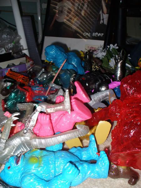
Now this is a weird guy here. MG5, or Missile Gorilla 5, by Zollmen kind of came out of nowhere earlier this year. No story, not much hype outside a single thread on skullbrain...

I'm not sure this figure got a lot of love from buyers once it was released, but I was excited from initially seeing it when Frank Kozik showed off a photo of a prototype in January.

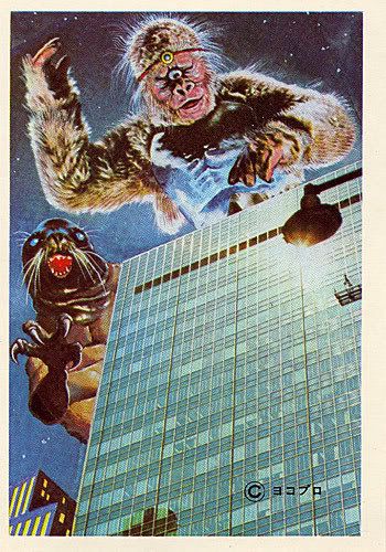
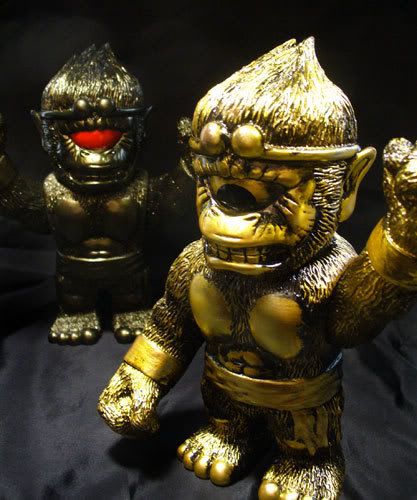
Not only goes the monster hearken back to the old die cast toys that had firing missiles, but it is also a goofily grinning King Kong ripoff, so how could I possibly pass this one up? We can just call this one patchi kaiju, since as far as I know it is a made up beast, and it definitely pulls elements of the legendary King Kong.

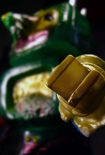
Apparently this figure is part of an ongoing line from Zollmen called Monster Parade. There have been a few minis released under this Monster Parade moniker... so perhaps this is a new series of toys to be released by Zollmen.


Header //3 out of 5//:
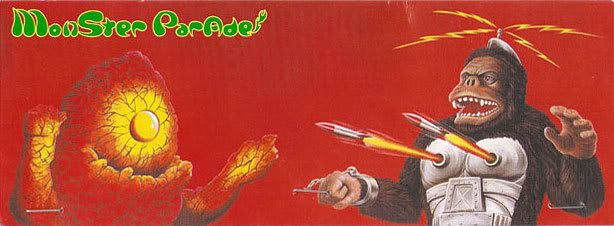
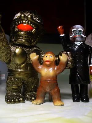
The front of this header is really cool. The illustration of the Missile Gorilla along with another figure, the Omake (that a mini toy of which was included with the shipment!) is really cool. Having the beasts in action, doing what they do best is why we all buy these anyway, right?

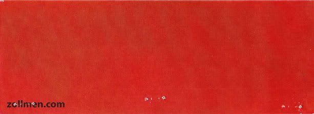
The back, however... zzzzzz

Just plain red with the zollmen website.

Also, this header doesn't actually have the name of the toy printed on it anywhere, so that is a little disappointing as well.

Sculpt //4 out of 5//:
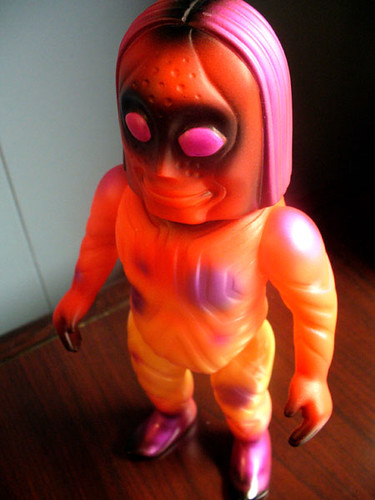
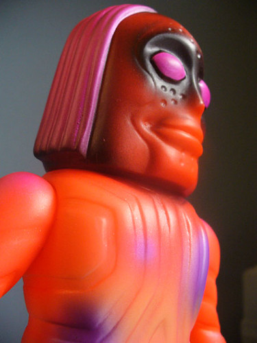
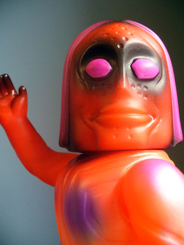
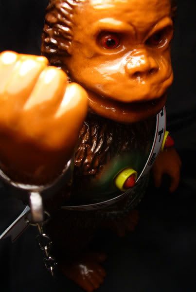
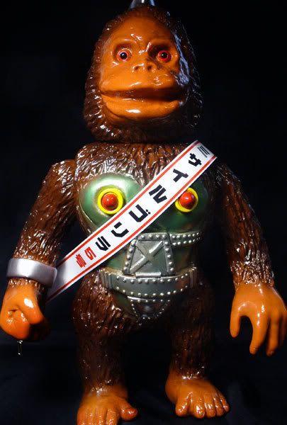
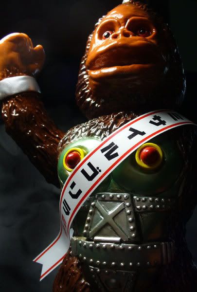
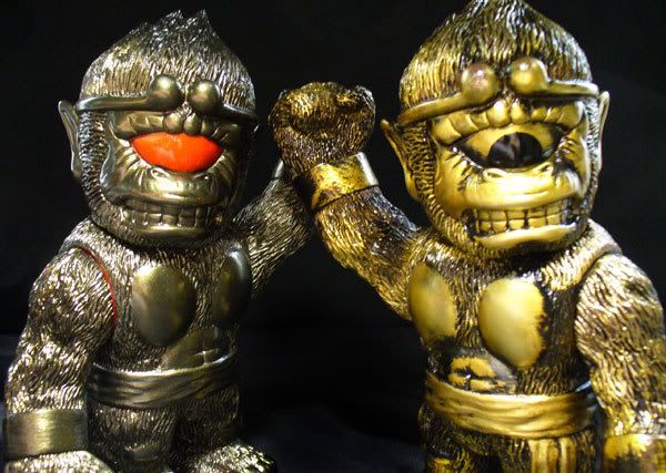
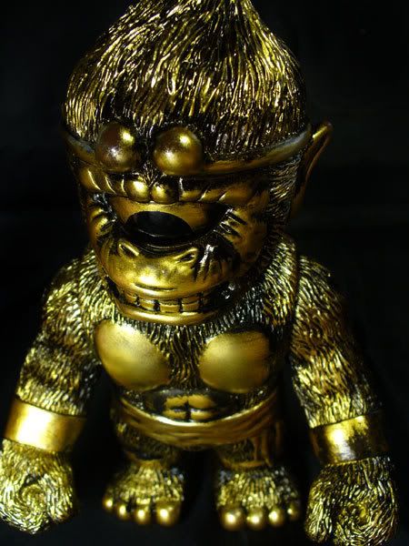
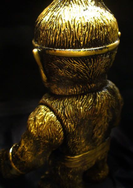
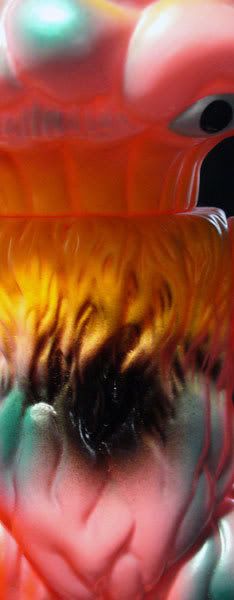
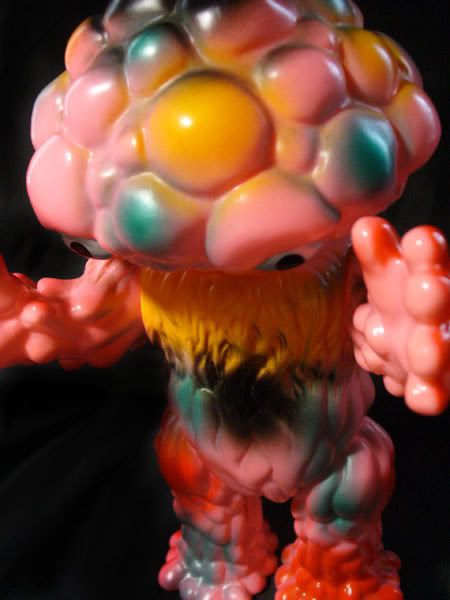
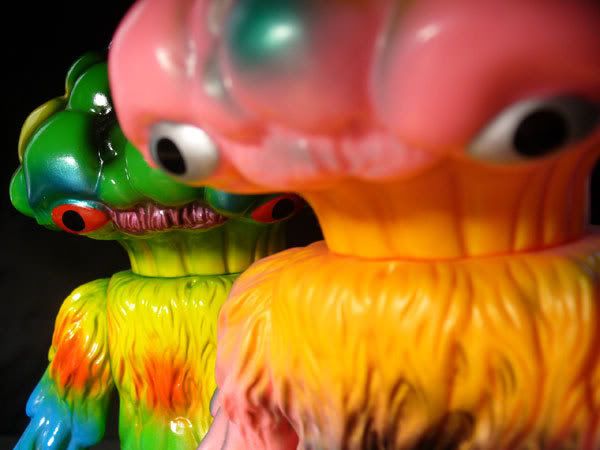
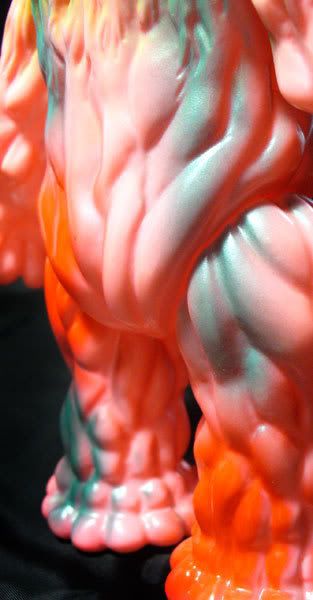
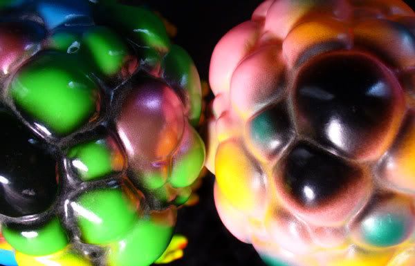
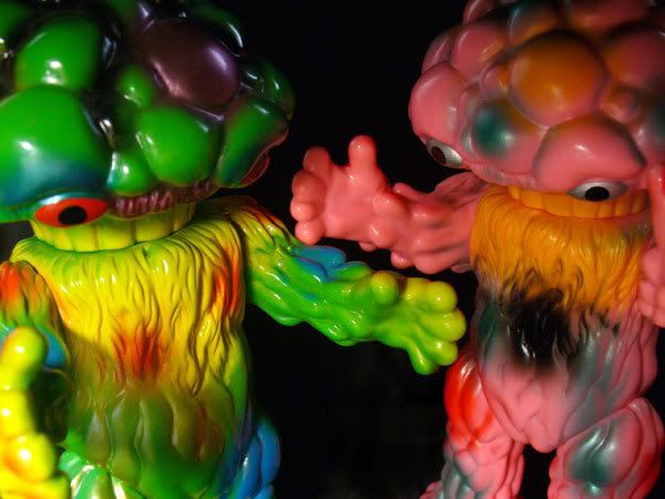
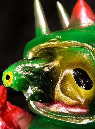
Maybe I am being too generous here given the lukewarm reaction by some, but I think the sculpt of this toy is phenominal! It has a nice DIY look while still having nice, thick vinyl and feeling very professional. It is what we want in these vinyl babies.

It is a creative mash-up of robot, gorilla and toy. We get the organic face that almost looks like clay with the subtle waves and bumps and such. While looking this way might look unfinished or rushed on some toys, with other smooth (metal pieces of the chest) and not-so-smooth textures (hair!) coming together on this figure, I can assume that this look was intentional, and it works well I think.

The hair is done well I think... not overbearing. I do not like it as much as the hair texture on Real Head's Cyclomanion, but it is done well.

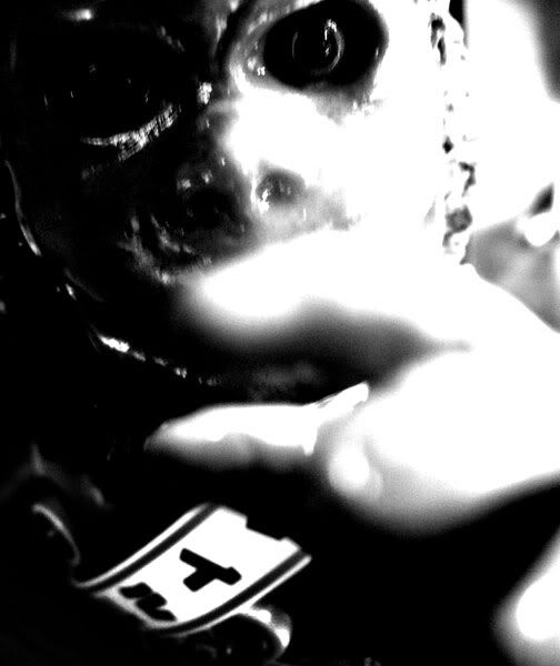
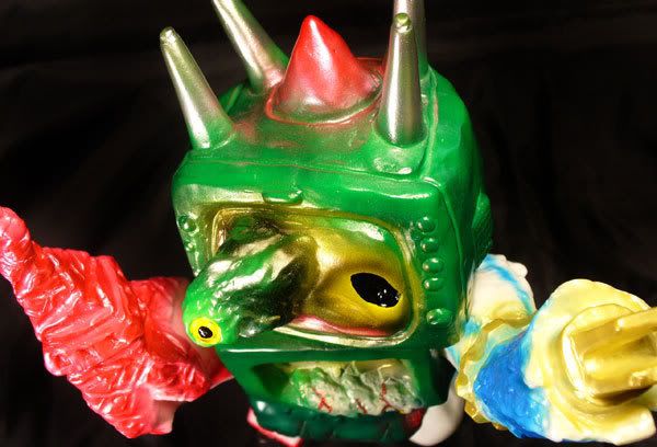
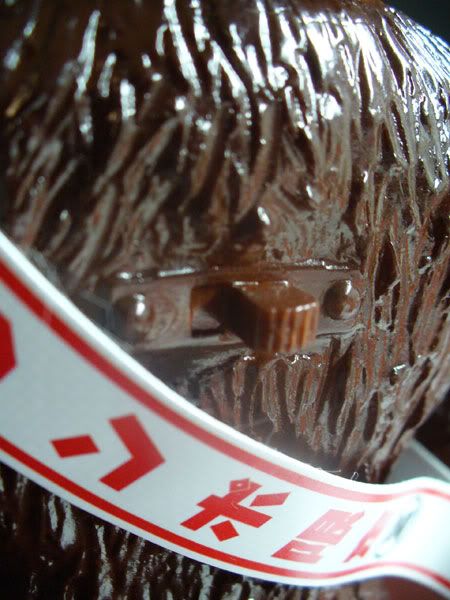
One great touch is the inclusion of a small on/off switch on the back. It's not a real switch, obviously, but a witty little touch that made me laugh when I saw it. You can see it pictured to the left here.

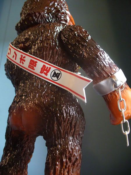
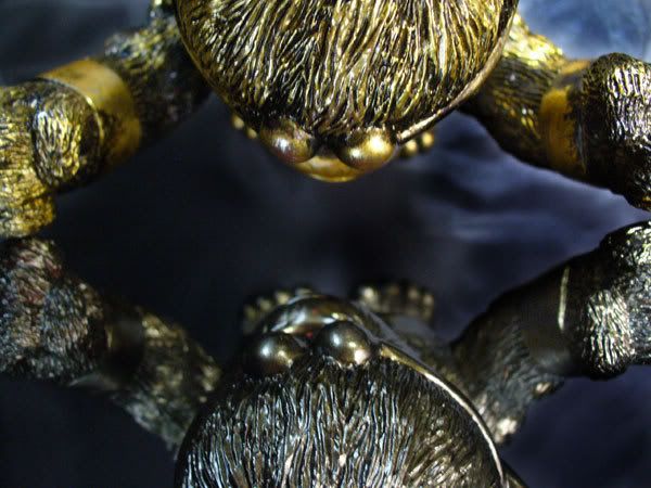
The remote control antennae on top of his head is a nice touch, and the nipple missiles are hilarious. Too bad they couldn't be real and actually fire like the old diecast toys this is paying homage to. Oh, and if you are going to have nipples on a gorils, you have to have a bare ass also, yeah?

And the couple little additions add to my admiration of this toy. While not part of the sculpt itself, the broken chain on the right handcuff is a neat addition... and the banner across his chest is cool and reminiscent of olf Japanese toys in the 60s and 70s. I know the Tigermask toys made by Nakajima had banners like this for instance.

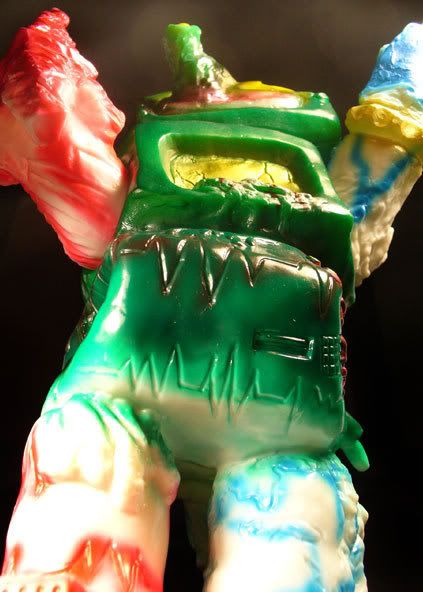
The figure is well balanced to be as top heavy as it is. it has a big head and long arms, but the base is spread out and flat enough to prevent it from teetering.

There is little articulation, though, and I would have definitely liked to have seen more. A waist joint and especially hip joints would have allowed some cool poses with this one. Being solid from the chest down was a little of a let down.

Paint //4.5 out of 5//:
It is a pretty literal and straightforward paint scheme for a gorilla with metal plates on its body, but I think it was the right choice with this being the first MG5. Leave the blues and the pinks for after the toy gets somewhat established.

The application is clean and well-masked where it needs to be... and soft and faded well where it needs to be. Very solid paint job. the gloss coat on it is fantastic. It looks waxy almost!

That said, I would also like to see future colorways that are more out there. I believe there is a slate blue that has just been released... and I wouldn't be surprised to see a pink and metallic version as well. Now that the monkey/ape color scheme is taken care of, they can go crazy.

Coolness //5 out of 5//:
gorilla --- check
nipple missiles --- check
robot --- check

Value //3 out of 5//:
Retail is a bit pricey, but it is a good sized figure and Zollmen seems to always include a mini figure with their big releases.

Overall //4.5 out of 5//:
Positives: great, glossy paint; heavy vinyl; good balance; nice homage to old battery operated toys; it's a robot gorilla with missile launchers in its chest

Negatives: lack of articulation; straightforward paint scheme

If you like the sculpt but aren't nuts about the paint scheme, wait a bit and I am almost certain you will see a crazier color come out. Regardless, though, this is a standout piece that is cool, tongue in cheek and fun.


Sunday, June 29, 2008

Cyclomanion by Real Head (Gold Mist version)

I just wrote about Cyclomanion (サイクロマニヨン ) by Real Head (リアルヘッド) just yesterday, but I had to show off the other one in the family, right?

This particular one is similar in color to many other colorways released by Real Head that people have dubbed Gold Mist. I'm not sure if Gold Mist is an official name or not. You can all (I think) of the RxH Gold Mist releases here:

(photo stolen from meczilla on skullbrain. click on the link for meczilla's flickr)

I even spy Cyclomanion in there!


Header //3 out of 5//:


Sculpt //4.25 out of 5//:

Paint //4.5 out of 5//:
I feel the same about pretty much everything on these two different Cyclomanions except for the paint. While I really like the Gold Mist color scheme, I think with this particular sculpt, the rubbed paint application of the gold one comes off a little better in showing off the strengths.

This figure appears to be made of a flesh colored vinyl with the bronzey paint applied. It is a nice, subtle hue and a slight metallic sheen. It is a great paint job, but I don't feel it highlights the toy as well as the other paint does.

The red eye is cool to me... very striking. it is the same high-gloss red on the eyes of the other Gold Mist releases (as you can see in the photo above.) It is well masked and almost looks as though it could be a separate piece placed into the face.


Coolness //4 out of 5//:

I still think this is a cool, solid RxH release despite liking the paint on the gold version better.

Value //3.5 out of 5//:


Overall //4 out of 5//:
Like the gold version, this is a great, well balanced pick up if you like its look.


Saturday, June 28, 2008

Cyclomanion by Real Head


There are some lines of toys I have just never acquired the taste for despite their high demand. But sometimes these companies release that one toy that finds a way into my niche little collection. Cyclomanion (サイクロマニヨン ) by Real Head (リアルヘッド) is that toy.


Ever since I was a kid, I have been a fan of gorilla themed toys. I hadn't had many apes in recent years outside random figures like a talking Optimus Primal from the Beast Wars cartoon. Lately I have been replenishing my ape collection with Japanese vinyl. They are mostly older toys, but Real Head released this figure, and it just fit in with the other apes living in my house.

I'm not sure exactly, but it was speculated on skullbrain that Cyclomanion was Real Head's take on the patchi kaiju image pictured to the right here. Patchi kaiju, or fake kaiju essentially, were cheap little trading cards that were drawn, painted, etc. in Japan in the 70s that often borrowed elements of certain popular monsters at the time and changed them up enough to have a recognizable yet original beast. The gorilla pictured here (with some strange looking seal/mole thing) looks to be a giant cyclops version of an old Spectreman villain called Ape Man Ra.

Real Head's Cyclomanion looks to be a take on this same image, perhaps. You don't see a one-eyed gorilla wearing some sort of headband or tiara very often.

Other than that, I really don't know much about this toy. I have a couple of them, but the review here will mainly focus on the newer gold version. I will post a couple separate photos of the red-eye version in another post.


Header //3 out of 5//:
No images on the header, but I think it works. I would like to have seen more toy-specific artwork, but I like the bold lettering and the textured color of the background. A decent, average header here.

Sculpt //4.25 out of 5//:
Besides the fact that I am a little biased towards simian themed toys, I really think this is technically a great sculpt. It manages to be something definitely unique to the Real Head line, while still maintaining the proportions and feel of one of their sculpts.

Like many fight-themed toys, Cyclomanion has short, stumpy legs and extra long arms. Obviously this style works for an ape as that is how they are shaped in real life for the most part.

The face has nice emotion and there are nice, expressive lines around the eyes and mouth that convey a sense of stress. Fighters experience stress, right?

The texture of the hair on the sculpt I think is what draws me to it the most here. Great attention seems to have been paid to a large part of the surface with the tiny grooves cover most of the toy. It really makes me want to pick up the toy and feel the texture in my hands. This rough furry texture is offset by the smooth surfaces of the wristbands, sash, chest, feet, and face. It keeps this toy balanced in it's appearance despite not having much paint applied.

Cyclomanion is very well balanced despite having very long, heavy arms, thanks to the broad feet. (Unlike a figure such as Chicken Fever who's heavy arms and tiny feet has him ready to take a plunge with a slight breeze.)

In a way I would like Cyclomanion's waist to be articulated, but at the same time, this sculpt matches the others from Real Head in that everything from the chest down is one piece with no seams. So I can see why it was done this way.

Paint //5 out of 5//:
This toy is by no means a complex canvas with tons of colors, nor is it an old school Japanese kaiju toy color scheme. But it is a paint style that most definitely compliments the sculpt. I can't tell exactly, but it looks like the toy is cast in a rusty colored vinyl, that was then sprayed with a heavy coat of gold paint. Then a thinner coat of black was sprayed over that then rubbed off. It gives the gold surface almost an antiqued or distressed look.

It works great on a surface such as this because of all the grooves left by the hair sculpt. The black stays in those grooves, really adding contrast with the gold.

The pupil is neatly masked , and accentuated well with the rubbed black texture around the eye.

Because of the gold paint, this toy makes me think of the fertility idol from the opening of Indiana Jones : Raiders of the Lost Ark. The mouth already looks similar, and the gold paint finished the correlation for me.

Coolness //4 out of 5//:
I'm not going to impress many people with this one, but for my little gorilla collection, Cyclomanion is a very cool addition. He has the apparent patchi kaiju connection going for him already, but even without that he is the only one-eyed gorilla wearing a tiara that I own (besides my other Cyclomanion that is).

This figure is not one of the more popular releases for the Real Head collector community, which is honestly a blessing for someone like me because it makes it that much easier to find. While everyone else is showing off their new blue Mutant Evil, or another paint rubbed Mutant Chaos, Cyclomanion represents my tiny Real Head collection much better.

Value //3.5 out of 5//:
Retail price on figures this size are rising it seems, so I may have to readjust my ratings on this category. You can probably find this figure on the secondary market for right around retail as people grow bored of it. It's a nice size compared to other comparable figures in this price range now, so it is a pretty nice price. It is not super limited or anything, as far as I know, so I wouldn't pay an arm and a leg for it at all.

Overall //4 out of 5//:
Positives: Nice color; great texture; well balanced; it's a one eyed ape with a crown!

Negatives: Lack of articulation, not a signature piece in a collection (I am nit-picking here, definitely.)

Cyclomanion is a solid piece in the Real Head catalog. He doesn't exactly match other Real Head toys, but that is the draw for me as I have never been a fan otherwise. He isn't flashy, but is a well balanced, cool looking figure that will look nice with other oddities on your shelf. If you like its look here, you won't regret picking it up.


Friday, June 27, 2008

Matango by M1Go (Hawaii colorway)

I previously wrote about the Matango (マタンゴ) by M1Go (M1号) here about a year ago.

I just wanted to show off a new member of the fungal family I received from a boardmember on skullbrain!

I pulled my old category scores from the previous Matango entry and applied them here... then elaborated on the Hawaii paint.

I've also added a bit about the headers for these toys, since I did not do so the first time around.

And, just for shits and giggles, pictured here is a poster from the movie!


Header //4.5 out of 5//:
No complaints here. I really like the hand drawn monsters and typeface on here. It advertises for the relatively new
company (to the older companies like Bullmark or Marusan for instance) and other products while still feeling vintagey.

I would have liked it if it were slightly larger, and if it didn't seem as generic as it does. For someone like me (a non-Japanese reader!), this header would be a little better if it highlighted the fact it was for Matango. As it is now, it seems it could be for any of the pictured mon

Sculpt //4.5 out of 5//:

Paint //4.5 out of 5//:
The Hawaii colorway was a paint style used by some Japanese companies in the 70s when they expanded their vinyl toy sales to Hawaii. The theory was that the more garish, tropical colored paint would sell better on the islands. Many toys were painted in this scheme despite their "real-life" counterparts not being anywhere close to that color.

I think this paint scheme compliments this figure well. I assume the monsters in the movie were some brown or green earthy hue, but the pinks, blues, and yellows here are playful and have that great vintage toy feel. I can see why people start collections of similarly painted figures.

I was a little disappointed to see that this toy does not have the usual high-gloss coat that so many M1Go toys seem to have. I'm not sure which toys get the gloss treatment, but I would like to have seen it here.

Coolness //4 out of 5//:

Value //4 out of 5//:

Overall //4.5 out of 5//:
Still a great toy that has great value. The Hawaii colorway is awesome on a figure like this one.


Tuesday, June 24, 2008

Dempagon by Longneck

Pile of junk or beautiful garbage? This one may be the classic case of beauty being in the eye of the beholder.

Here is the latest offering from the company Longneck. This hideous beast is called Dempagon (デムパゴン). This particular version is Dempa-gon ver 2.0 2008 according to the gold label on the header card.

The monster itself is a mish-mash of various items. It is in the theme of Junk Kaiju.... or junkheap... monsters that are made of various debris, or are even themselves moving trash heaps. Maybe Hedorah fits in this family too as he seems to be made from toxic sludge.

I've seen a few toys made in this theme, and I know of the monster Garuban from the old television show Captain Ultra. Hopefully I'll soon be reviewing a giant Garuban I got recently. The others I have seen have mainly been large pieces of trash forming a humanoid shape. One monster made by Kaijuken even has an airplane tail sticking out of his ass.

Dempagon is a bit different from these others in that he is made up of some pretty strange items. He is a surreal combination of household items such as a computer monitor, some sort of plug on one arm, an upside down old style television for a head, and what appears to be the Tokyo Tower for his right arm. Either it is a tiny tower, or the other parts are supposed to be enormous.

The color scheme on this figure is an homage to an old and very awesome vinyl toy of the Barom-1 demon Frankenruge. There has been a new version of Frankenruge made by Rainbow, as well as a Mutant Chaos by Real Head painted in this scheme. Dempagon is slightly different... you can see pictured here that the colors are mirrored from where they appeared on the original toy.

It looks like someone looked at Dempagon's horns one day (the feet of the upside down television) and thought they resembled the antennae on the vintage Frankenruge. It was a good find, regardless of how it happened.

It seems that Longneck is taking this Dempagon figure in these sorts of directions, as there is a version coming soon that is based on King Joe and one that even resembles a panda bear!


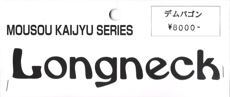
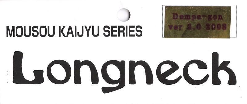
Header //1 out of 5//:
I have to say, Longneck has some boring headers. from what I can tell, they all look exactly like this, with the price on the front, and a sticker on the back with the name of the toy. No color except for the gold foil sticker, and the font isn't all that attractive. Meh.

Sculpt //3.5 out of 5//:
Nothing clean about this guy. This is the kind of sculpt, I believe, that people either really like or really dislike. I could be wrong, but sometimes it seems these messy themed toys attract a certain collector and repel many. I really like it, but there are a couple things I wish were different.

As I said above, this guy is a mash up of lots of different parts, most of which seem to be electronic devices... the television, some sort of monitor, the plug... There is even a keyboard and mouse on his back, a cell phone protruding from a black hole in his hip, and what seems to be an electrocardiograph for a pelvis! I really like the assortment of items that I have never seen in a toy like this before.

The addition of the Tokyo Tower for an arm is a bit strange given the size of all the other included items, but I can appreciate the random addition. I believe it makes the figure stand out more than if the arm were simply a sharp household device.


The figure has some nice textures in places, like the broken parts of the monitor on his chest, the cross beams of the tower arm, and the nondescript garbage textures on the left arm, legs, etc. However, I would like these textures more if they did not look so hand drawn. It is almost as if the main sculpt of the figure had a lot of thought and effort, and the surface was then glossed over. While this is a way to have the toy really feel like a do-it-yourself project, here it feels rushed. Another Longneck toy, Gas Bawer, has awesome texture, and it doesn't look this way. There are even lines etched into Dempagon where you can see where the extra clay was pushed into a ridge along. I think this would have really benefited from a little cleaning up and more thought out textures.

There isn't much in the way of articulation either. While I will admit knowing virtually nothing about the casting process, I think this toy could benefit from legs that rotate at the hip and a head that turns. As it is now, there is a big seam at the waist which is nicely concealed between two blocks that meet, and the arms rotate at the shoulder. The feet are a little off on mine, which causes some slight balance issues, but this can be corrected with the hairdryer treatment I am sure.

Paint //3.75 out of 5//:
As with the sculpt of this beast, there are parts I like and parts I do not like about it.

I think it is cool that it is an homage to the Frankenruge villain. It is an interesting color scheme and choice. I really like Dempagon's face/head with the large saggy eyeball and the metallics on the feet of the upside-down television. The paint here almost gives a plastic like texture... which sounds kind of stupid now that I look at it typed out because the toy is made of a plastic. But something about it just looks different, and I like it. The shading on the sides of the extended eyeball are a nice touch.

There is a lot of color here, and the application is nice for the most part. The fades and colors chosen all over the body are well executed, ranging from yellow highlights on the back of his head, to the deep, black pit on the left hip.

The part that bothers me actually is the paint on the legs and upper arms. Obviously the point was to mimic the veiny look of the Franenruge, but in my opinion the application is almost clumsy. The airbrush stream is a little wide, and on the red side in particular, it seems like a rushed trace over the sculpted cardiograph lines. While it probably can be argued that this application is reminiscent of a vintage paint application, I think it could have benefited from a little more care and time. This is, after all, an expensive figure, not a cheaply made toy meant for play in the sandbox by children of the 70s.

Coolness //4 out of 5//:
I'm a sucker for these oversized, ugly toys. It is appeasing to me to have someone see a figure such as this and have a "what the hell is this?" type of reaction.


Value //2 out of 5//:
I bought this in the US and paid twice as much as what it sold for in Japan. Ouch. Had I known that were the case beforehand, I probably would not have rushed to order it. But if you can get this for closer to the Japanese price, I think it is a much better value.

Overall //4 out of 5//:
Positives: Large, nice paint for the most part, interesting combination of junk parts to make a unique monster

Negatives: Expensive, bulky, not many poses available, certain elements of its production feel rushed


Yeah, I know I had some issues with parts of this toy, but something about it just draws me in. It's a mess, but in a good way. I don't own anything else that looks like it, but at the same time I think it goes well with such toys as Gas Bawer and Bemon.


Monday, June 23, 2008

Ever have one of those evenings...

...when you are cleaning or reorganizing or something, take a mental inventory of all the stuff you have accumulated in a given amount of time...

...and completely feel overwhelmed and disconnected from it all?

I posted some photos the other day on skullbrain after starting to reorganize my Detolf of the hideous mess I had created in our bonus room.


I beared down and started cleaning up this clutter. I moved shelves around, finshed the installation of lights, decided what went where.

There is still more to do even now, but when I look at my space and my things, i am feeling burnt out, broke, and overwhelmed by too much still.

What is it in me that keeps me buying this stuff when i am going to look at it in a few months and not feel good about it? It was like this before toys came back into the picture, and it probably will be if they ever go away.

The feeling is on and off with me. I have had it before. When a lot of bills are due, it brings it on for instance. There are other times I will look at the toys one by one and I really like them... and it is hard to let go. I feel like something should change though. Something fun shouldn't stress me out like this.

One thing I have found is that my stupid little photo stories make me enjoy my toys in a new way. They are like the grown up version of playing with them I suppose. This blog too.

While buying the toys feeds some weird anxiety in me that constantly opens my wallet, arranging them, photographing, telling stories, and those sorts of things provide a creative outlet. I really like the feedback I get on them... having people laugh and look forward to more... or compliment me on a setup or a story... validates it all.

It's a constant seesaw with this hobby I have found so far. I am still looking for that proper balance.

Wednesday, June 18, 2008

SteCasse King by Romandoh

Here is an old review that for some reason I never posted. I guess I was too lazy to format it and put in the photos. :)


Company:
Romandoh

Packaging:
Tear-off blister pack

Where Can I Buy It?:
eBay

Price Range:
$10-12

Sculpt //2.25 out of 5//:
This is a pretty unique shape as far as figures like this go. He is rotocast, which is a negative, but has somewhat bendy legs which is kind of cool. The fact that it is rotocast helps somewhat however because it is already topheavy as it is with the spindly legs and falls over pretty easily.

The feet on the bottom actually look like headphones with little black holes which is a nice touch.

The faces included are all different and a cool addition as well.

I think the mold could have been done a little better on the back shelf that holds his extra tapes... they fall out very easily. There should have been some sort of lip or something that the tapes could rest behind. Also, the tape compartment doesnt actually hold a tape... the door opens (but doesnt stay closed... it likes to flop open) and the hinges of the door get in the way of a tape going inside.

The tapes themselves are pretty cheap hollow plastic that are open on one side. This fact though does allow the figure to sort of hold the tapes as you can put one side of his hand inside the tape bottoms and balance it that way. The hands are too fat and rounded to actually hold anything though.

Paint //4 out of 5//:
The figure definitely makes up some ground here. To be cheaply made, the paint job is still nice. Even the cheap tapes have an airbrushed look to them. There are gloss and matte areas (like the glossy headphone feet) which adds to the quality of the figure.

Articulation //1.5 out of 5//:
Virtually none. His arms rotate at the shoulders. His legs are kind of bendy and can rotate some at the hips. His head can turn all the way around... and I guess the PLAY door that opens on his chest can count as articulation? Accessories (4 out of 5): Another place where the figure comes out in the positive. SteCasse King comes with 4 different heads (hollow plastic that slide down on a piece of rectangular plastic attached to the body like a sleeve) that all have different facial expressions. It is also cool that he has five tapes that rest on a shelf on his back despite the fact that the tapes can hardly be held by the figure and cannot be placed inside his chest (i'm spoiled by the Transformers toy Soundwave)

Coolness //4 out of 5//:
I still think this figure is quite cool despite its shortcomings. I think it is a very original character design and makes for a neat toy. When he is just standing there he looks very cool and you can change his mood with the 4 faces included. However, if i played with this at all it would lose cool points has he is tough to make stand right and his tapes like to fall out.

Value //3.75 out of 5//:
As far as Romandoh figures go, this guy was a good bargain, but I would still feel like I paid too much were it a figure I bought at Toys R Us or something.

Overall //3.25 out of 5//:
I am probably biased just because I think the character is so cool, but this figure still scores a decent score overall

Good points - Looks cool; good paint; unique design; lots of faces to change out

Negative points - Hard to pose; cheap construction; tapes fall out and dont fit in his chest; fat hands cant hold onto anything Buy this one if you like what he looks like. But if you want to stylistically pose him or play with him much, it probably isn't worth the price.


Monday, June 16, 2008

Adding Kanji

I am going to try to add kanji to the Japanese toys I discuss here from now on to assist anyone who may be looking for it. I want to go back and add it to past reviews.

Just a heads up for all my loyal fans.

Oh, and I totally stole this idea from the
Omni-Monster blog. His kanji has come in handy for me quite a few times.

Tuesday, June 3, 2008

Custom M1Go Dada by LASH "Virusy!"

Here's another Dada (ダダ) I had sent to LASH to be painted up.

Unlike the previous radioactive Dada, this Dada has the standard face and was made from flesh colored vinyl instead of glow-in-the-dark.

This one doesn't have a name as far as I know, but it is quite a drastic change once again from the stark black and white lines of a normal Dada. There are all sorts of colors here... from the warm tones of his skin to the metallic looking purples on top of his head, shoulders, eyes, feet and the "virus" spots. The black serves to really make certain areas pop.