Monday, December 31, 2007

New Years Resolutions - 2008

Everyone has these... and they are so often complete bullshit. But I have started on a couple for myself and I hope to hold onto them for a change. The secret - I made them attainable so they would be easier to hold myself to!


1) Control my spending on stuff I don't really need. Reign in those costs!
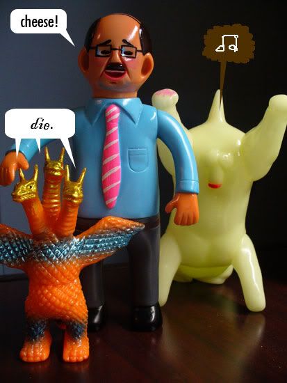
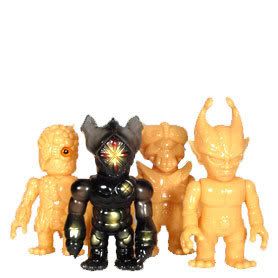
That includes toys! Not much to say here... I've had trouble with my spending habits for years, and this was a particularly bad one. It's more an anxiety thing than anything, so I need to focus my energies on creative outlets instead of pulling out the credit card whenever I get bored/down/etc.

2) Keep a sketchbook/journal.
I've tried this one before with little success. But the approach is different this time. Using Chris Ware's Acme Datebooks as inspiration, I want to write and draw in the same book. One problem may have been that I tried to write one place and draw in another. If they happen together, they can feed off one another even. This will help keep my creativity flowing hopefully. I do have a separate sketchbook for all monster/toy related things such as photo stories and whatever, as well as a sketchbook for design stuff I need to work on. This is for me

I already bought a sketchbook with drawing paper inside and a couple drawing pens (Don't worry, I bought them before the New Year, so Resolution #1 can still apply)... which leads to resolution 3.

3) When sketching/writing, stop erasing so goddamn much!
A problem with things I have kept in the past is my need for perfection... or as close as I can get to it. I have to realize that no one is going to see these things unless I want them to, so I should draw and write for ME... not with anyone else in mind. So if I like the new Britney Spears album and want to gush about it in my journal with a shitty doodle of a My Little Pony, then I need to just do it. Working in pen I hope will help this constant tweaking on things that are only personal.

4) Work on more art.
I need to get back into painting and photography. I have the supplies... I just haven't had the drive.

5) Lose 15 pounds.
A more common one obviously. I broke 200 lbs for the first time a couple months ago, and I'm not thrilled about it. Time for more sit ups (more could be 1 a day at this point!) and less candy.

6) Become a big brother in Big Brothers/Big Sisters.
I have wanted to do this for a few years now, but I haven't lived in one place long enough to do so. When you move every 12 months or less, it's not really good for a mentor type position.

7) Take a martial arts class.
This probably won't happen, so I put it last. For one I don't think I need the added expense such a class will bring, and two I am lazy and have games to play/things to draw and photograph/toys to paint. I want to take one more to learn self discipline, control, etc. more than learning fighting techniques.

Anyway, I guess I will update in a year and see which ones of these actually happened!

Happy New Year!

Saturday, December 29, 2007

Toypunks vol. 1


I was finally able to sit down and watch this new DVD recently, and I have to say I quite enjoyed it. At a runtime of about 45 minutes, it is full of clipped interviews from various influential figures in the street fashion and vinyl toy industry.

There is a lot with Hikaru Iwanaga, the founder of Bounty Hunter, which is fitting as it was his toy, the Kid Hunter, that essentially started the designer toy surge way back in 1997. There is a lot of interesting insight from the different interviews about their influences from overseas, old cartoons, etc.

I enjoyed seeing the bits with various collectors too... hearing why people like certain toys and why they collect the things they do. Seeing the sweet collections was nice too.

One thing that bothered me about the movie was not actually something with the movie, but rather with Frank Kozik's interview clips in the extra features about the "underground"... or in his opinion the lack thereof. I don't know exactly what to think about underground artwork, toys, etc., but in this clip, Frank says that if you are out there to sell toys then it is no longer underground.

Most likely, this comes down to semantics, but the thing that bothered me was the attitude about it all that came across in his interview. I'm no pie in the sky artsy guy bemoaning the death of the underground art world, but it seemed Frank's opinion is that it is all black or white. He said he has no trouble with Wal Mart and entities like that, and for some reason it felt a little disappointing to me. I'm not sure exactly why.

I will be the first to admit that what I do for a living (graphic design) is pretty much selling out artistically speaking, and I have no problem with someone wanting to make a living with their craft, but the attitude that Kozik seemed to express here is one of embracing the selling out and the lack of an underground. It's hard to explain for me, but it waters down Kozik's work to me... like there is less feeling put into the things he puts out maybe... like it cheapens it all in a way.

Shit, what do I know? I'm just a loser on a crappy blog who will most likely never make money on toys or art.

I'm not great at reviewing movies and stuff like that, but this little film serves as a great primer into vinyl toy collecting, design, etc., and I look forward to volume two.

Great job, guys!

--------------------------------------------------------------------

On an aside, another thing I thought was awesome about this flick was seeing my Bounty Hunter photography in there! I don't like to toot my own horn, but I was really excited when Justin from the toypunks crew contacted me about the photography I display on this little blog. It was very cool sitting here watching the movie, seeing my photographs alongside the others with the punk music and interviews, and then seeing my name in the credits.
The toypunks guys were really cool and considerate in asking to use my photos, and this copy of the movie i watched was complimentary for their use. I am proud that these photos became a part of the project.


Friday, December 21, 2007

My first custom paint job

I'm moving this article from late November until now to better match up with my Hedoro Kun blog

I tried out the new Iwata airbrush on a vinyl toy for the first time on this toy. It's nothing special by any means... I took a my purple Hedoro Kun by Bounty Hunter and made it gloss black.
I like how it turned out - I decided not to try anything else since the solid color looks like a Bounty Hunter style color scheme anyway.
This was mainly a chance for me to see how the airbrush works on a 3-dimensional surface and to see how v-color paint lays down and dries and stuff like that.


Thursday, December 20, 2007

Hedoro Kun by Bounty Hunter

This is actually the first Bounty Hunter figure I purchased. There is no real reason for it other than it was the first one that became available to me when I went on my BxH buying spree, but it is fitting because Hedorah was in fact the creature that got me hooked on all these Japanese toys in the first place. What I found appealing about Hedorah was the way that different companies would approach his sculpt. It is a free flowing form essentially that has been presented in many different shapes and colors. 

As far as I know, there is no story behind this figure other than it is jsut paying homage to the classic smog monster Hedorah from the 70s Toho Godzilla movie. Many Bounty Hunter toys do just that... they aren't trying to be witty and out there... just cool, simple toys that work and show respect to things that Hikaru Iwanaga holds dear.

Header //N/A//:
The same Bounty Hunter clear plastic bag.

Sculpt //4 out of 5//:
This figure looks like what you would get if you took the OG BxH Kun and caked it with purple candle wax. The figure is actually cast in solid purple vinyl. There are other HedoroKuns around cast in other colors as well.

It still has the familiar Kun proportions with the big belly, lobes on his head, bear trap style choppers, long arms, and squared feet with not much in the way of legs. 

The waist joint could fit together a little better I think, as it is very obvious where it is. The lumps don't really match up. Having the waist able to turn, however, does add to the poseability of the figure. 

Unlike other BxH Kuns, no matter what position it is posed in, this figure seems to maintain its balance very well.

The feature I like the best of this toy are the bejeweled eyes. They really make the focal point of the figure the face. The Hedorah character from the original movie had large, colorful, unusually placed eyes that really stood out. Other companies that have made Hedorah toys have made the eyes a focal point, and Bounty Hunter has done it in a simple and unique way.

Paint //N/A//:
No paint.

Coolness //2.75 out of 5//:

It's not the most eye catching Bounty Hunter toy, and it isn't the most unique. The purple color makes it stand out from its brethren, but it's not the flashiest of the bunch by any means.

Value //4 out of 5//:

The purple version of this toy is not super difficult to find, and can probably still be found for close to retail. At that price, it is a good value.

Overall //3 out of 5//:

Positives: Started off my BxH collection as my kaiju collection started; bejeweled eyes

Negatives: Kind of boring in comparison, waist joint

This is a solid piece and I am glad I have it. It photographs well and adds a little variety in the Bounty Hunter group. I think I would like this figure better in black. The only one I have seen like that is in Iwanaga's personal collection. 

Wednesday, December 12, 2007

Giant Chiteidako Zoromederu by AnrakuAnsaku


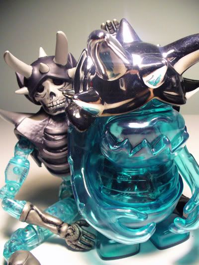
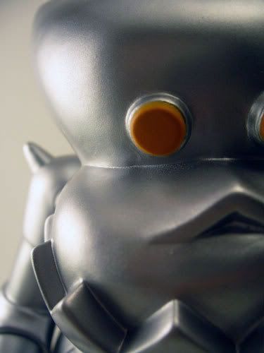
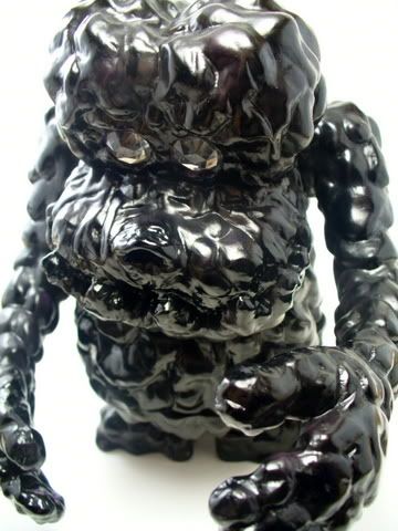
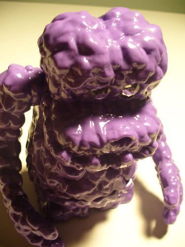
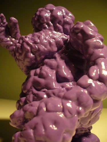
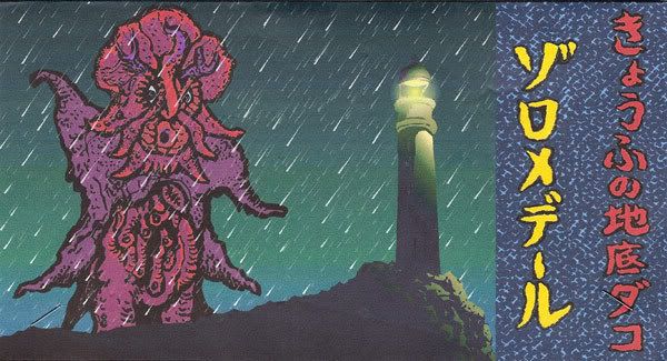
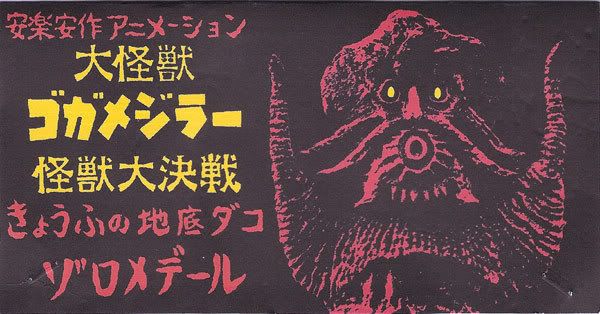
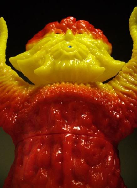
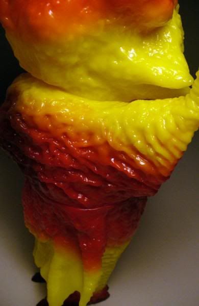
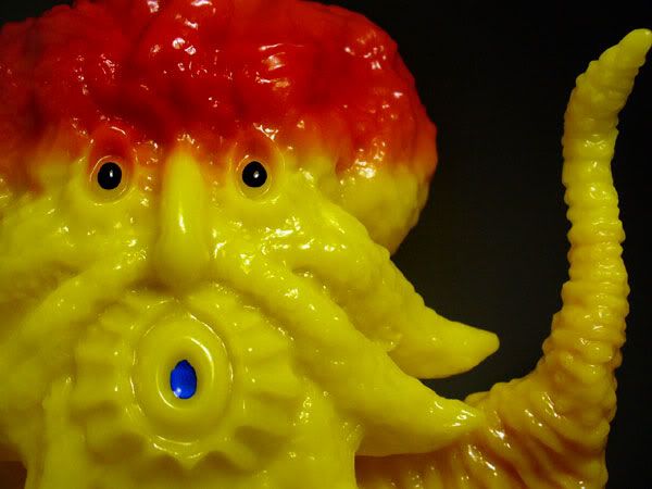
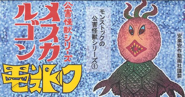
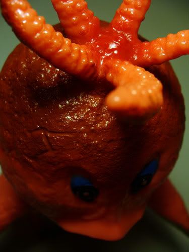
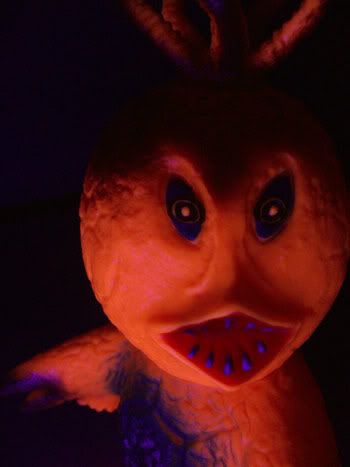
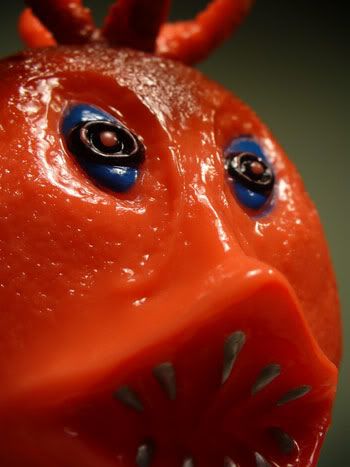
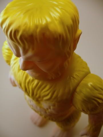
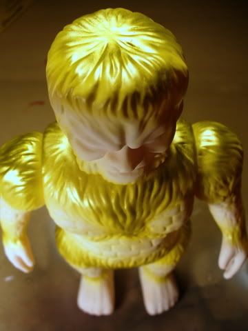
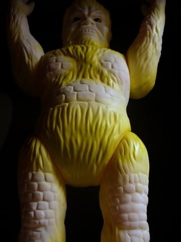
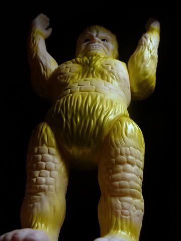
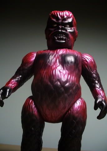
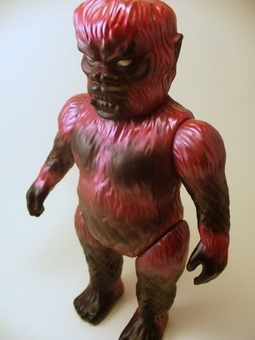
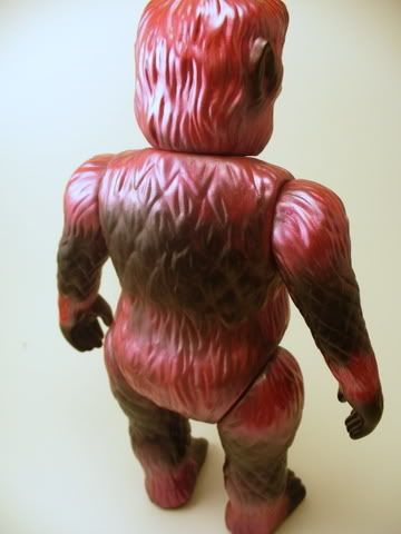
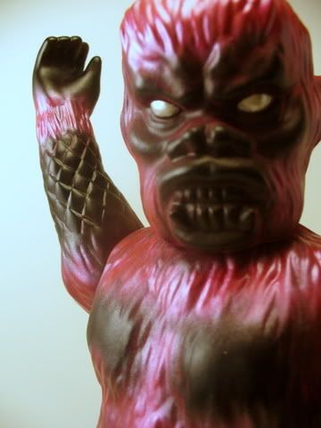
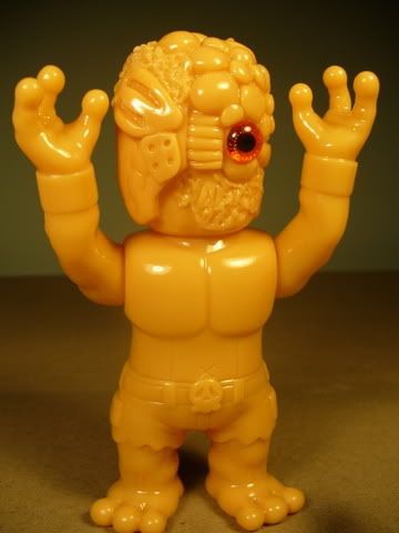
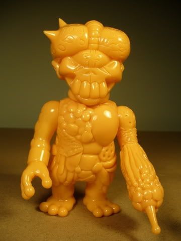
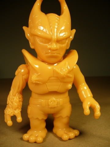
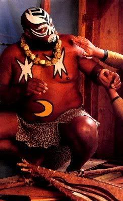
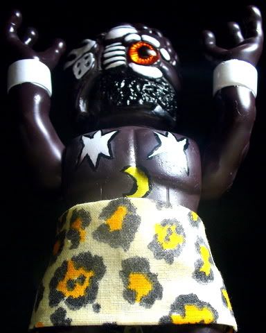
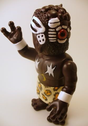
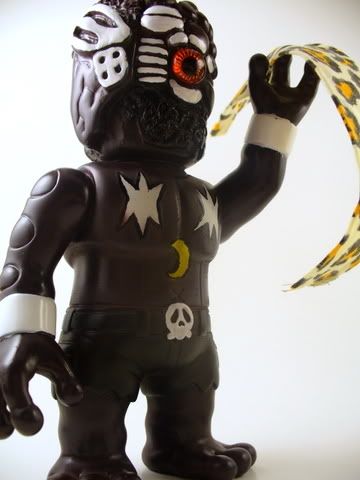
Here's another AnrakuAnsaku! Meet Giant Chiteidako Zoromederu, or Dako as we American guys seem to call him.
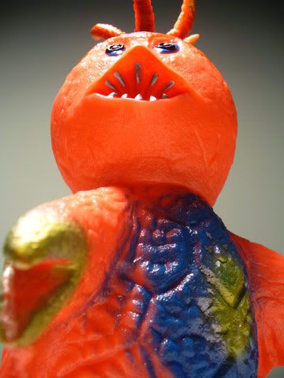
The name Dako, seen at the end of the word Chiteidako, has something to do with octopus, and you can see that in this figure. And like the Gogamejiras, on www.anrakuansaku.com you can find Flash movies of Dako up to no good as many giant monsters like to do.


In these movies, you can see Dako flying around on what appears to be helicopter-like spinning feet, and his tentacles constantly flail about. Also, Dako seems to be able to light up his eyes like flashlights and even shoot what are possibly electrified beams from them. He destroys buildings and airplanes and lives under the sea as any great monster should.
Due to the yellow/red color scheme of this particular Dako, I first saw it called the Mustard/Ketchup Dako, but my favorite one is the Hogan Dako. If you know a little about Hulk Hogan, you may remember at a certain point in virtually every Hulk Hogan wrestling match, he would look beaten and then at the last moment would "hulk up" and make a comeback. It's funny because when Hogan would hulk up, he would begin the process by staring up at his opponent with wide, round eyes and wildly exhaling through pursed lips and blown up cheeks... pretty close to the face of this toy!
And again, you can see the artwork for Dako on this print to the right of the Gogamejiras:

Header //4.75 out of 5//:
This header is more like the Goga header than the Mescalgon header was. I've said it before about these, but I really like the homemade "zine" feel they have to them. I like this one a lot. The front of the header features artwork similar to what would appear in one of the website's Flash movies... Dako rising from the sea. I actually wish my Dako was painted to look like this particular artwork. The back of the header is darker. Dako appears here with much more text that I don't understand in a cool, shadowy image composed of basically 1 color (2 if you just count the creepy yellow eyes.


Sculpt //4 out of 5//:
As far as moving parts go, the Dako also is simpler in its design. There is a seam at the waist, and this one also has one at the neck although, because of the tentacles, you can't really turn the head. I would like some movement in the tentacles as well.


The body shape reflects the aquatic nature of the character well looking almost spongy. The texture, as on the other Anraku pieces I have written about, is fantastic and very detailed - with tiny additions like suckers on the tentacles. The oversized head while looking like an octopus, has an almost humorous human-like face that seems to say oooooo!

Judging by the flash movies, the lower part of the body should be turned as I have it below (in the rear shot), but there are 2 feet that would allow you to logically rotate the lower half and give the figure what would be sort of a webbed apron as opposed to the cape that it does now.

The vinyl is nice and heavy with a nice glossy finish, and the figure is well balanced.

Paint //3.5 out of 5//:
This is a decent paint job, but not as impressive as other Anraku pieces out there. It's pretty simple overall with host of the application being spray red over yellow vinyl. There is a dark brown spray on the feet that is a nice touch, as well as hand applied black eyes and blue mouth.

Technically there is nothing really wrong with the paint, but I just don't find it all that exciting.

Coolness //4.5 out of 5//:
I will always think Anraku toys are cool and make a big toy statement. The bright color of this guy will draw the eye on a shelf as will the facial expression and raised tentacles.

Value //2 out of 5//:
Picked this one up secondhand again, which is going to put some hurtin on the bank. At retail, Anraku pieces are definitely worth the cost!

Overall //4.25 out of 5//:

Positives: Bright, large, nice texture, Hulk Hogan similarities, reversable lower body

Negatives: Pricey, limited poseability

Another homerun by AnrakuAnsaku. If only I could get on "the list."


Thursday, December 6, 2007

Mescalgon by AnrakuAnsaku

From my favorite low-run vinyl toy producer AnrakuAnsaku comes this frightening figure: Mescalgon

Like Gogamejiras, there isn't much background provided for Mescalgon... actually there is even less from what i can tell. A theory forwarded to me by miami on the skullbrain.org message board is that Mescalgon is named as such due to his resemblance to the mescal (or peyote) cactus from which mescaline is derived. Mescaline is a hallucinogenic drug for those of you not in the know. :) Miami thinks that Mescalgon also looks like the opium poppy, and I have to say I can agree there.

Time for fantasy world! Maybe Mescalgon not only has his bulk and most likely some sort of breath weapon, a water based corrosive acid mixture, but also can unleash hallucinogenic chemicals that will send his opponents into a dreamlike state in which Mescalgon can really do some damage.
Those head tentacles could probably do some boring into brains when his opponent is sitting in a lifeless state, dreaming about riding a bike or other such nonsense. As i said in my review a couple months ago about Gogamejiras, this company makes some pretty unique and old style monsters... and all to me have an almost kewpie doll feel to them in a way with their outstretched arms and big bellies.


The artwork for Mescalgon is on this print here on the lower left as well as some of their other beasts.


Header //3.75 out of 5//:
While the header card does reflect the art style of Anraku, it also seems just as much an ad for MonStock, the store where many of these figures are sold. It is a heavier stock paper than the Goga header and overall looks more professional. While this is not necessarily a bad thing, I liked the homemade "zine" feel of the Goga packaging and thought it fit the style of the toy better.


Sculpt //4.25 out of 5//:
Mescalgon is ultimately a simpler piece in its design than the Gogamejiras. It has fewer "moving" parts as only the head is articulated.

The sculpt is what appears to be a plant like head and a flying sea creature body. The head even could be seen as aquatic as the tentacles on top look like they could be from an octopus. I like the look of this figure quite a bit.

With all the other Anraku toys I have seen, the surface texture is phenominal. Rarely can you find plain, smooth surfaces, and these textures vary as you move to different body parts. The small scales worked into the large scales on the chest are great, and the ridges down the back add even more variety without being overwhelming. Even the eyeballs have dimension on this toy. It really shows great attention to detail.

I only wish there was somehow more stuff to pose outside of turning the head.


Paint //5 out of 5//:
I have no problems with the paint on this figure. The base is orange vinyl and the paint applied compliments/contrasts this color as it should. The application shows the highlighting areas such as the top of the head/face and torso as vintage figures would have been painted. There is even hand painted areas such as the eyes and teeth.

The head tentacles, which to me are an important part of the sculpt, are given added dimension by the under stray of the red to match the top of Mescalgon's head.

The blue and metallic gold farther down on the figure work well together and offset the head well. The streak down his back looks really nice.


Coolness //4.5 out of 5//:
Anraku toys are ones that, if you are into this genre, you just feel cooler owning. It is very unique like the Gogamejiras (and the Hogan Dako that I will write about soon! :) ).

I gave it a 4.5 because I still think the painted Gogas are cooler and I don't want both to be perfect! haha


Value //2.5 out of 5//:
Unless you are on the magical list, you're going to pay probably about double what these toys retail for. While I got a much better deal on this than the Goga, it was still pricey.


Overall //4.25 out of 5//:


Positives: Great paint and texture, unique character, bulky, photographs well


Negatives: Pricey, no poseability other than a turning head


Mescalgon was another one of those toys that sort of fell in my lap as Anraku toys seem to do. The texture and now color application are both some things that will keep me coming back to this company.


Angel Sanda round 2 - I shook up the gold!

Before then after shots.

thanks to LASH for the assist

A thorough shaking to the gold made it a completely different paint. The gold looks so much better now.

I went back and added to the original yellow layer and gave a light misting to the brick looking areas of his skin for a very pale yellow and the hint of glitter


Sunday, December 2, 2007

Angel Sanda

From the same set as the Demon Gaira. This was also unpainted flesh colored vinyl.

flat white with varying shades of gloss gold

darkest golds are top of head, shoulders, hips and crotch

The Man with the Golden Crotch!

The gold doesn't come across perfectly in the photos... it looks yellow even though I used no yellow

All in all, I have to say I like the results of silver VColor better than gold for sheen and coverage, and if i were to do it over, I think I would go for a gloss white base on this one as opposed to the matte

I was told to try shaking up the gold even better, so I may add more to this one


Demon Gaira

More custom painting work by yours truly

Gaira and Sanda were the two giant monsters from the War of the Gargantuans movie made by Toho in the 1960s

This figure started as plain flesh colored vinyl

flat black with red/silver fur highlights.

eyes are plain silver.

I feel like this needs something more - more color? highlights or something on the scaly looking areas? Painted mouth?

comments welcome!


Friday, November 30, 2007

Chaola the Ugandan Mutant

My first real custom paint job!

I am by no means a Real Head
(リアルヘッド) fan... in fact the set I bought of unpainted figures was my first figures from the line outside of one figure what was part of this year's Super7 Halloween set.

(and my Super7 Halloween set has since been sold off)

Here is the set:

Mutant Chaos on the left, Jinja-R next (which I did not get as it was a random drawing), Akrokaiser with the big head, and Mutant Evil on the right with the antennae. They honestly still don't do anything for me outside of perhaps the Chaos. Perhaps.

Anyway, I busted out the hairdryer and my concentration face and mixed them all up because ultimately I wanted a Chaosman to customize. Here's what I came up with:

The Chaosman:
(Mutant Chaos head on Mutant Evil body)


Caveman Akro:
(Akrokaiser head on Mutant Chaos body and Mutant Evil right arm)


Cell Evil:
(Mutant Evil head on Akrokaiser body and "damaged" Chaos right arm)
I hope to actually paint this one to look like Cell from Dragonball Z

Now that I had my blank Chaosman, time for the inspiration!

AND... drumroll............ the finished product!


they say you are your own worst critic, and right now i am feeling this one is a near-disaster from a technical standpoint

looking on the bright side, though, i practiced a lot of techniques on this figure, so more than anything it was, and will continue to be, a learning experience.

problems i had were
-not mixing the paint to the right consistency... leaving a dusty looking finish on the brown surface
-trouble with masking... definitely need to practice this
-mixing colors. elementary stuff here- brown! and i still seemed to mess it up. wasted a lot of paint being impatient
-hand painting - i need to figure out how to get the brush strokes out. i could start with a better brush.... my bristles were too long i think

if any of you pros have tips on these problems or anything you may notice, please feel free to share. everyone can learn from my mistakes!

anyway... here is attempt #1 at a real custom. after more practice i will probably strip this and try it again.